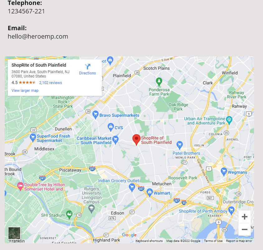
When building pages within Systeme io, you may come to a situation where you need to insert Google Maps.
You may be looking high and low for the “Map” element but couldn’t find it in both Funnel builder and Blog builder.
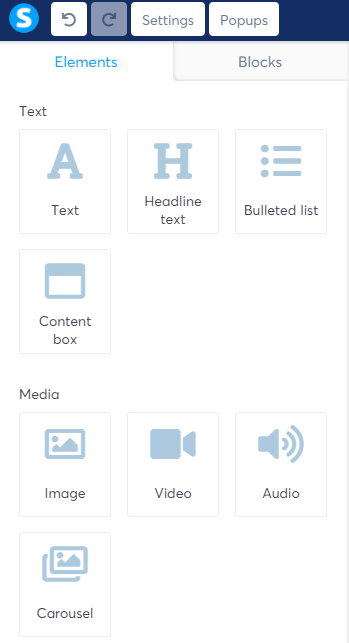
In Blog builder, the elements are pretty much the same as the Funnel builder, except that Blog builder has additional “Blog” elements.
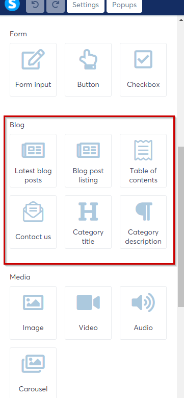
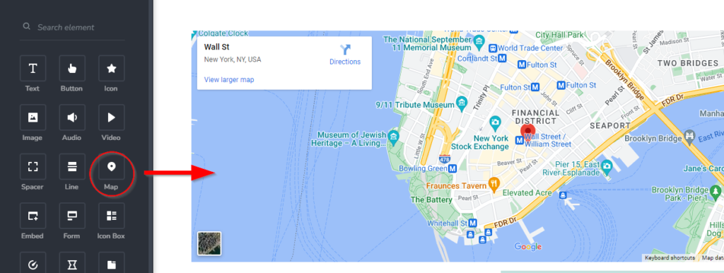
Having said that, the Map element is still nowhere to be found. Some builder (eg Brizy Cloud) has the map element which makes inserting a location map a breeze. so how do you insert Google Map to your Systeme’s page?
Easily Embed The Map To Systeme Page
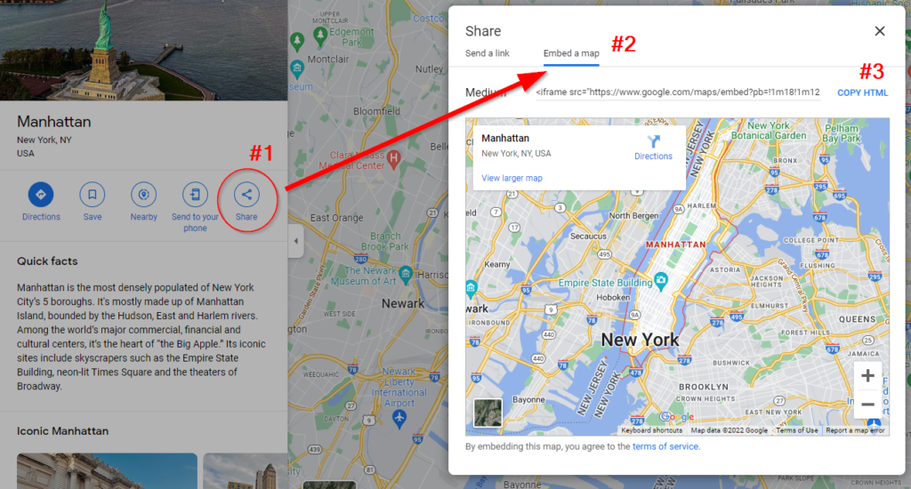
To embed a map of your desired location,
First, go to maps.google.com and enter your location
Next, click on the Share icon (#1) – Embed a map tab (#2) and you’ll see the map of the location.
Then, click COPY HTML to copy the iframe code.
Now open up Notepad on your computer and paste the code that you just copied into the Notepad
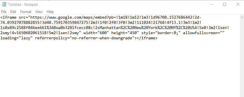
If you are a newbie, don’t get overwhelmed because you do not need to understand the code. Just copy and paste. There are a few things you need to add to the existing code so that this iframe code becomes mobile responsive. Otherwise, if you skip this step, the page will not be mobile-friendly (or rather device responsive).
There are 2 ways how to do it. Option 1 is recommended as it is easier.
Option 1 (Recommended)
From the code that you pasted in the notepad, look for the width=“600” (the width can be 800, 600, etc depending on the map size you generate the embed code earlier (refer to the screenshot below)
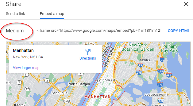
In this example, the width is 600 and the height is 450 pixels.

change the width to 100% and the height, it depends on your preference. You can leave the default height and preview how the map appears on the webpage, and come back to adjust it accordingly (if necessary). Here’s how it looks like after you change the width to 100%

Option 2
Copy the code below and paste it above the original Google Maps embed code in your notepad.
<style>
        iframe {
            display: block;
            max-width: 800px;
            max-height: 600px;
            width: 80vw;
            height: calc(.75 * 80vw);
            margin-right: 10px;
            border-radius: 4px;
        }
</style>
Once you’ve pasted the code in notepad, your code will now look something like this:
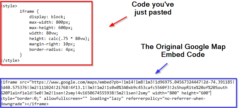
Next, in the original google embed code, you want to remove width=”800″ height=”600″. The final code after you have removed the width and height will look as follow:
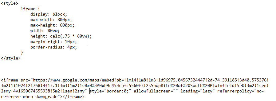
Insert Code Into The Page
Now, on your Systeme page, insert the Raw HTML element to your page.
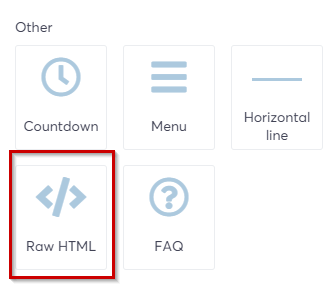
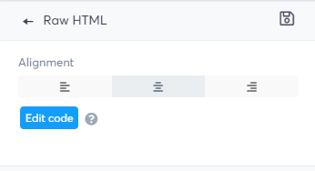
Select the Raw HTML element that you have just inserted, and on the element window on the left, select Edit code to bring up the HTML editor.
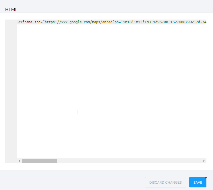
copy and paste the code that you have amended earlier in NotePad. Then click Save.
Your map now should appear on your page and more importantly, it is now device responsive. Regardless of what devices you’re viewing it on, it resizes automatically to fit the device.

